

Schools tend to have something of an old-fashioned presence on the internet. Primary school websites especially are known for being too colourful, and, lets face it, it can be difficult to read their content!
 USE COLOUR WISELY
- A neutral background is always a good idea as it’s easier to read text on.
- Use colour to create energy and attract the eye.
- Ensure that the colours you choose work well together.

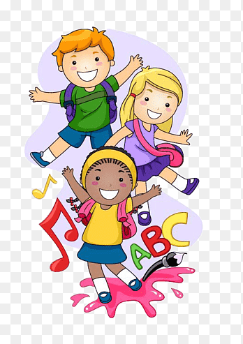
 USE IMAGES OF HAPPY PUPILS
A positive image can bring out positive emotions for parents who might be worried being away from their children.
Its also a great marketing tactic if you’d like to attract students to join your school.
Minimize risks:
- Avoid full face photos
- Don’t display young children in swimwear.
- Use watermarks.
- Obtain parental permission before featuring kids on sites.
 USE A CHILD-FRIENDLY MASCOT
- Mascots are popular with both parents and students.
- They create memorable branding for your school.
- They can display the desired emotional effect.


 DON’T HESITATE TO USE HUMOUR
- Humour can be a useful tool to make your school popular.
- Studies show humour reduces stress levels and anxiety.
- NEVER, EVER, EVER SLIP INTO SARCASM THOUGH!
 ONE SITE FOR EVERY SCREEN
- Parents might be looking for a school website on their mobile devices.
- Make sure your school web design is responsive, in order to adapt on the size of the screen.